LINE
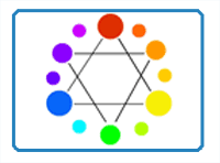
Colour
Types of colour
 Colour is one of the element of art and design. The color wheel was
developed by Sir Isaac Newton by taking the color spectrum and bending
it into a circle. The color wheel is made up of three different types of
colors - Primary, Secondary, and Tertiary. (Fussell,M, 2017)
Colour is one of the element of art and design. The color wheel was
developed by Sir Isaac Newton by taking the color spectrum and bending
it into a circle. The color wheel is made up of three different types of
colors - Primary, Secondary, and Tertiary. (Fussell,M, 2017)

Primary colours
The primary colors are red, yellow, and blue. No two colors can be mixed to create a primary color. Primary colors can only be created through the use of natural pigments. Secondly, all other colors can be created by mixing primary colors together.

Secondary colours
The secondary colors are orange, green, and purple. Secondary colors are created by mixing equal parts of any two primary colors.
Yellow + blue = green
Red + blue = purple(violet)
Red + yellow = orange

Tertiary colours
Tertiary colors are created by mixing equal parts of a secondary color and a primary color together. There are six tertiary colors- red-purple, red-orange, blue-green, yellow-green, blue-purple, and yellow-orange.

Warm colors: red, yellow and orange.

Cool colors: blue, violet and green.

Complementary colours
Colors found directly across from each other on the color wheel.
Example:
Blue and orange
red and green
yellow-green
red-purple.

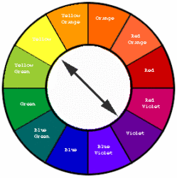
Monochromatic- literally means one (mono) color (chroma).

Analogous colors- are colors that are next to each other on the color wheel.

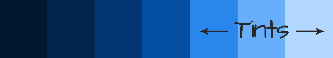
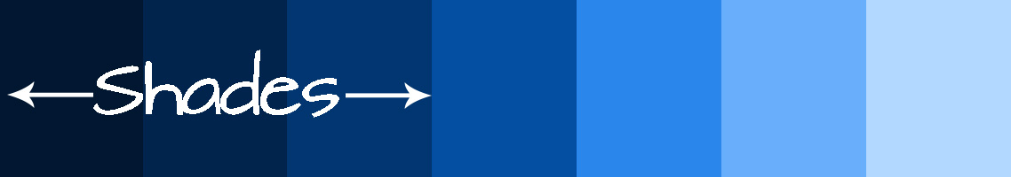
Value
Value is the lightness or darkness of a hue (color). The value of a hue can be changed by adding black or white. Light values of colors are called tints. Darker values of colors are called shades.
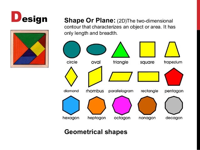
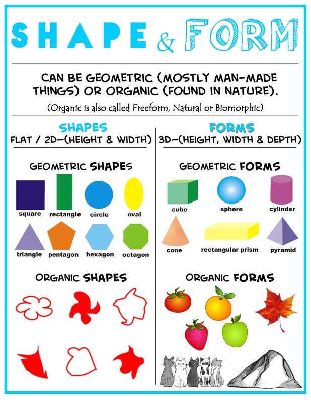
SHAPE
Shape is a 2-dimensional line with no form or thickness. Shapes are flat and grouped into two categories, geometric and organic.
-Square and rectangle -strength and stability
-Circle and ellipses- continuous movement
-Triangles-lead the eye in upward movement
-Inverted triangle- sense of imbalance
Form is a 3-dimensional object having volume and thickness. It is the illusion of a 3D effect that can be implied with the use of light and shading techniques. Form can be viewed from many angles.
VALUE
Value/tone - is the degree of light and dark of a colour. It is the contrast between black and white and all the tones in between.It can be used to:


SPACE
Space - refers to variations in the perspective, and proportions of objects, lines or shapes. Space refers to the area within, around, above or below an object or objects. There is a variation of sizes in space of objects either real or imagined.


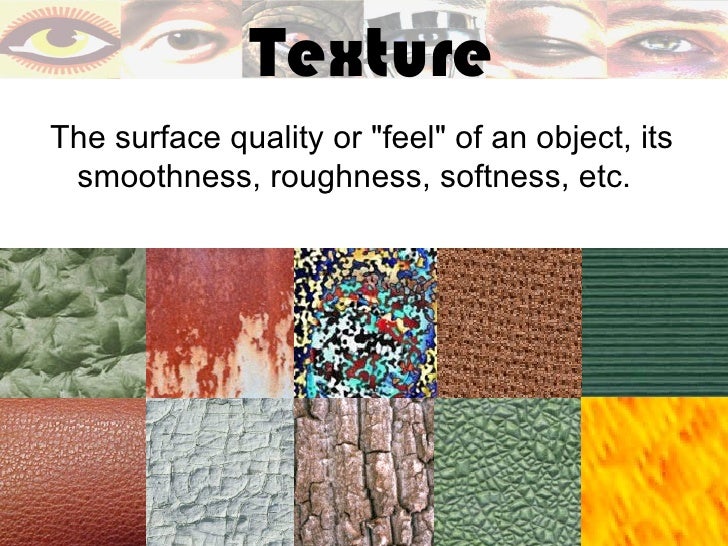
TEXTURE
Texture is about surface quality either tactile or visual. It is the degree of roughness or smoothness in objects.


Principles of Art
BALANCE
Balance is a feeling of visual equality in shape, form, value, color, etc. Balance can be symmetrical or evenly balanced or asymmetrical. Objects, values, colors, textures, shapes, forms, etc., can be used in creating a balance in a composition. A large shape close to the center can be balanced by a small shape close to the edge. A large light toned shape will be balanced by a small dark toned shape (the darker the shape the heavier it appears to be).


PROPORTION
Proportion refers to the relative size and scale of the various elements in a design. The relationship between objects, or parts, of a whole is necessary to discuss proportion in terms of the context or standard used to determine proportions.
Examples:
body and face proportion :

Larger size to give emphasis :
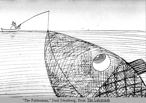
EMPHASIS
Emphasis is an area that first attracts attention in a composition. This area is more important when compared to the other objects or elements in a composition. This can be by contrast of values, more colors, and placement in the format.

 VARIETY


RHTHM AND MOVEMENT
Rhythm - is a movement in which some elements recurs regularly and the flow of objects that will seem to be like the beat of music.
Directional Movement - is a visual flow through the composition. It can be the suggestion of motion in a design as you move from object to object by way of placement and position. Directional movement can be created with a value pattern. It is with the placement of dark and light areas that you can move your attention through the format.


HARMONY
Harmony brings together a composition with similar units.


References:
Line is a
mark on a surface that describes a shape or outline. Line is formed when two dots are joined together. Types of line can
include actual, implied, vertical, horizontal, diagonal and contour
lines, dotted line, wavy line,freehand line, thick, thin line and etc.

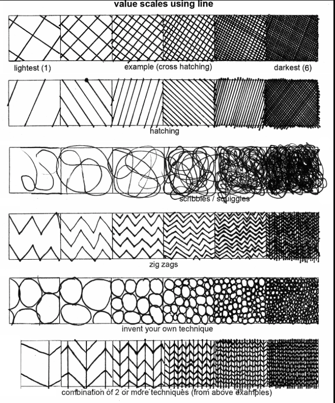
Figure 1: Line (Awesomeartists, 2003)

Figure 2: Value scale using lines
Colour
Types of colour

Figure 3: Types of colours
The primary colors are red, yellow, and blue. No two colors can be mixed to create a primary color. Primary colors can only be created through the use of natural pigments. Secondly, all other colors can be created by mixing primary colors together.

Figure 4: Primary colours
Secondary colours
The secondary colors are orange, green, and purple. Secondary colors are created by mixing equal parts of any two primary colors.
Yellow + blue = green
Red + blue = purple(violet)
Red + yellow = orange
Figure 5: Secondary colours
Tertiary colours
Tertiary colors are created by mixing equal parts of a secondary color and a primary color together. There are six tertiary colors- red-purple, red-orange, blue-green, yellow-green, blue-purple, and yellow-orange.
Figure 6: Tertiary colours
Warm colors: red, yellow and orange.

Figure 7: Warm colours
Cool colors: blue, violet and green.

Figure 8: Cool colours
Complementary colours
Colors found directly across from each other on the color wheel.
Example:
Blue and orange
red and green
yellow-green
red-purple.

Figure 9: Complementary colours
Monochromatic- literally means one (mono) color (chroma).

Figure 10: Monochromic colours

Figure 11: Analogous colours
Value
Value is the lightness or darkness of a hue (color). The value of a hue can be changed by adding black or white. Light values of colors are called tints. Darker values of colors are called shades.


Figure 12: Value
- Hue: Hue is the name of a pure color, such as red, blue, or yellow.
- Shade: A colour shade is created by adding black colour
- Tint: A colour tint is created by adding white colour to it
- Tone: A colour tone is created by adding grey to it.
- Intensity: Brightness or purity of a colour. A dull colour has a low intensity. Intensity of color is changed by adding varying amounts of its complimentary color. For example, to make a bright green duller a little bit of red could be added to it.
SHAPE
Shape is a 2-dimensional line with no form or thickness. Shapes are flat and grouped into two categories, geometric and organic.
-Square and rectangle -strength and stability
-Circle and ellipses- continuous movement
-Triangles-lead the eye in upward movement
-Inverted triangle- sense of imbalance
Figure 13: Geometrical shapes
FORMForm is a 3-dimensional object having volume and thickness. It is the illusion of a 3D effect that can be implied with the use of light and shading techniques. Form can be viewed from many angles.

Figure 14: Shape and form
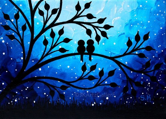
VALUE
Value/tone - is the degree of light and dark of a colour. It is the contrast between black and white and all the tones in between.It can be used to:
- to create the illusion of form
- to create a rhythm or pattern within a composition.
Figure 15: Value (pinterest, 2017)

Figure 16: Light to dark
Figure 17: Artwork using value of blue(Etsy, 2018)
SPACE
Space - refers to variations in the perspective, and proportions of objects, lines or shapes. Space refers to the area within, around, above or below an object or objects. There is a variation of sizes in space of objects either real or imagined.
Figure 18: Positive and negative space (victorfont.com, 2018)
Figure 19: Space (Pinterest, 2018)
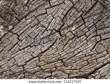
Texture is about surface quality either tactile or visual. It is the degree of roughness or smoothness in objects.
- Optical Texture:using of skillful painting technique to create the illusion of texture. For example, a cactus painted on a paper looks thorny and sharp.
- Physical Texture: expressive brushstrokes which the texture conveys the physical and emotional energy of both the artist and his/her subject. Example using oil paint, sand, cloth to create an artwork.
- Ephemeral Texture: This is a third category of textures whose fleeting forms are subject to change like clouds, smoke, flames, bubbles and liquids.
Figure 20: Optical texture (tes, 2018)
Figure 21: Texture (Slideshare, 2017)

Figure 22: Physical texture
Principles of Art
BALANCE
Balance is a feeling of visual equality in shape, form, value, color, etc. Balance can be symmetrical or evenly balanced or asymmetrical. Objects, values, colors, textures, shapes, forms, etc., can be used in creating a balance in a composition. A large shape close to the center can be balanced by a small shape close to the edge. A large light toned shape will be balanced by a small dark toned shape (the darker the shape the heavier it appears to be).
Figure 23: Balance
Types of balance:- Symmetrical
- Assymmetrical
- Radial

Figure 24: Symmetrical, Assymmetrical, Radial (Mr. johnson's Art room, 2017)
PROPORTION
Proportion refers to the relative size and scale of the various elements in a design. The relationship between objects, or parts, of a whole is necessary to discuss proportion in terms of the context or standard used to determine proportions.
Examples:
body and face proportion :
Figure 25: Proportion in human body (devianart.com, 2018)
Larger size to give emphasis :

Figure 26: Proportion (Jirousek, C, 1995)
EMPHASIS
Emphasis is an area that first attracts attention in a composition. This area is more important when compared to the other objects or elements in a composition. This can be by contrast of values, more colors, and placement in the format.

Figure 27: Emphasis (Walkonsocks.com, 2017)

Figure 28: Emphasis (Thinglink.com, 2017)

Figure 29: Variety (Canyon Crest, 2018)

Figure 30: Artwork (Prezi, 2018)
Rhythm - is a movement in which some elements recurs regularly and the flow of objects that will seem to be like the beat of music.
Directional Movement - is a visual flow through the composition. It can be the suggestion of motion in a design as you move from object to object by way of placement and position. Directional movement can be created with a value pattern. It is with the placement of dark and light areas that you can move your attention through the format.
Figure 31: Rhythm and movement
PATTERN
Pattern- made
by repeating or echoing the elements of an artwork to communicate a
sense of balance, harmony, contrast, rhythm or movement.
- Natural Pattern: Pattern in art is often based on observing the natural patterns that occur in nature. We can see these in the shape of a leaf.
- Man-Made Pattern: Pattern in art is used in structure and decoration

Figure 32: Pattern
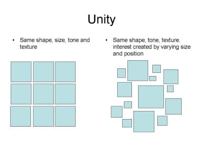
UNITY
Unity - Unity is the relationship among the elements of a visual that helps all the elements function together. Unity
gives a sense of oneness to a visual image. Unity in a painting also
refers to the visual linking of various elements of the work. Unity can
be achieve through use of:
- similar shapes.
- common pattern.
- space
- common background
Figure 33: Unity (Landscapers Mornington Peninsula, 2017)
Figure 34: Unity and harmony (Tes, 2017)
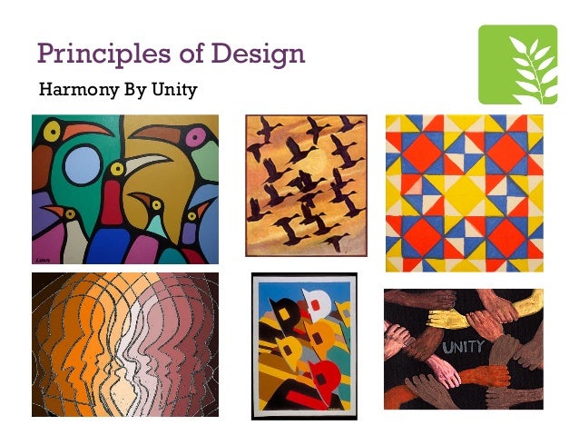
HARMONY
Harmony brings together a composition with similar units.
Figure 35: Harmony (Pinterest.com, 2017)

Figure 36: Harmony (nonprints.com, 2017)
References:
Weebly.com, Elements
of design, weebly.com,
accessed on 19 September 2016, url: http://elements-of-design.weebly.com/line.html
Fussel,M, 2011, The elements-form, thevirtualinstrutor.com, accessed on 19
September 2016, url: http://thevirtualinstructor.com/form.html
Fussel,M, 2011, The elements-value, thevirtualinstrutor.com, accessed on 19
September 2016, url: http://thevirtualinstructor.com/Value.html
Incredible art department, 2014, Elements and principle of design, incredibleart.org,
accessed on 17 September 2016, url: http://www.incredibleart.org/files/elements2.htm#idc-cover
The Virtual Instructor, 2017, Color Theory- The elements of Art-Color, The Virtualinstructor.com, accessed on 11th January 2018, url:http://thevirtualinstructor.com/Color.html
Art foundation, Elements of Design: Colour, Art Fundation site, accessed on 11th January 2018, url: http://www.wcs.k12.mi.us/cousino/wcsart/Art%20Foundatons%20Site/color.html
Jirousek, C, 1995, Principles of Design, Art Design and Visual Thinking, accessed on 13th January 2018, url: http://char.txa.cornell.edu/language/principl/principl.htm
No comments:
Post a Comment