What is the purpose of imagery??
Imagery is used to deliver a message with simplest form, than using a long essay. With image, the person who doesn't know a certain language, can get the meaning since image is easy to be understood and interpreted. It is also to evoke feelings, emotions and also imagination of the viewer. In imagery, sometimes words are combined with picture to give the direction for the viewer since an image can have many different interpretations.
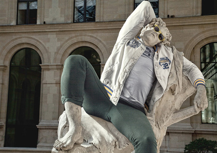
Aronson (2013), said that juxtaposition is one of many different rhetorical moves and creative devices used as a persuasive strategy to articulate meaning. In image juxtapose, a contrasting concept or opposite idea is added to the original concept that gives a surprising relationship. One of the example is Hipster in stone, which has classical statue and casual apparel of hipster which have 2 different styles.
Figure 1.0: Hipster in Stone VI - The Barberini Faun
Figure 1.2: Children playing near Beirut, Lebanon (Steve McCurry,1982)
Other than that, imagery is also used in
typography. Knight (2012), said that visual elements of typography speak louder
than words. Image is used together with letters to give same or different
meaning. In this context, visual language is stronger than verbal language.
Figure
1.3: ad campaign to raise awareness of deforestation (Greenpeace)
The
font, style, colour represents the packaging of the chocolate brand Kit Kat at
the first glimpse. But in this picture, the word is changed to ‘Killer’. That
means Greenpeace wants to tell something about nestle company, and Kit Kat
production are related to killing something.
Figure 1.4: poster for
the US band Liars (Munn,J, 2010)
In this poster, some of the parts of letters are removed. The
letters are unrealistic, which does not have the real shape, which can describe
the word liars.
As a conclusion, imaginary is used in art to deliver a message in a simplified form, and clearly to the viewers.
Reference:
- Aronson, 2013, Juxtaposition: Part 1 - Visual images, Youtube, url: https://www.youtube.com/watch?v=og__CiMQro8
- Artsy, 2016, Leo Caillard, Victori Contemporary at Scope Miami 2012, accessed on 8 October 2016, url: https://www.artsy.net/artwork/leo-caillard-hipster-in-stone-vi-the-barberini-faun
- Block, D 2012, Using Juxtaposition to Enhance Your Photography, Photoshelter Blog, accessed on 8 October 2016, url: http://blog.photoshelter.com/2012/05/using-juxtaposition-to-enhance-your-photography/
- Bobbe, 2015, Half-drag at Pop International Gallery, LelandBobbe, accessed on 8 October 2016, url: http://lelandbobbe.com/blog/category/half-drag/
-
Knight, C, Glaser, J, 2012, When Typography Speaks Louder Than Words, Smashing Magazine, accessed on 8 October 2016, url: https://www.smashingmagazine.com/2012/04/when-typography-speaks-louder-than-words/


No comments:
Post a Comment